
It is understood that the days of designing a website for a single desktop screen are over. The advanced technology and the expansion of mobile websites are making web designers re-think how their work is illustrated across several devices.
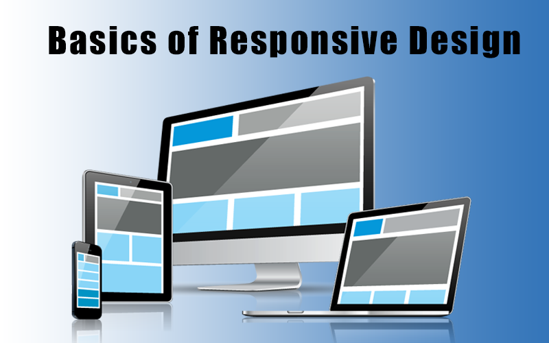
Responsive web design (RWD) is an important approach that permits design and code to respond to the size of a device’s screen. Primarily, it gives you the optimal viewing experience whether you’re viewing at a 4 inch android mobile, your iPad mini, or a 40-inch cinema display. The best responsive websites use fluid grids, flexible images, and CSS styling to alter the site’s design and render according to the width of the respective browser.
Is Responsive Design So Crucial?
Yes. It is important as such it would be a major key to responsive web design effectively knowing your audience and what device they’re utilizing to view your website. Also one can know how much of your current traffic is desktop vs. tablet vs. mobile?
Each major web browser has a mobile version of its own and renders sites differently. So it’s key that the design works and actively responds to a variety of browser versions.
What Website Dimensions Should I Design For?
As such, there is no standard website size. There are thousands of devices out there, and model sizes and screen resolutions could change all the time. Moreover, each website attracts users on different devices. Also, you can find out what browsers and web page sizes are most familiar for your site by searching at Google Analytics.
Design with At Least 3 Layouts
A responsive website design must have at least 3 layouts for different browser widths.
- Small: under 600px
- Medium: 600px – 900px.
- Large: over 900px.
Each of these layouts must comprise the same text and graphical elements, but each could be expediently designed to top display that content based on the user’s device.
Things to Keep in Mind
User Experience is crucial
- consider the user’s experience, their interaction and the important content they’re looking for while using a mobile device
Don’t design for the latest mobile device with a particular screen dimension
- design your site around your content
Engagement
- The hierarchy of the layout is super important, especially on mobile
Flexible images
- Think about how an image will scale and how would it look on a large desktop screen vs. a tablet vs. a small mobile screen
Navigation
- Could be in the popular hamburger style menu, a simple dropdown selection; expand/collapse fields, or use tabs that scroll horizontally like YouTube.
Gestures
- Users adore reading with their hands and interacting with the content as it actively empowers the user.
Design
- Design 3 versions for different browser widths, Use under 600px, 600px-900px and 900px+
Altogether, if your business is looking for App Promotion Services, App Marketing, Digital Marketing Services at Madurai, Mobile App Development, SEO Services, Bitcoin Exchange Script, HYIP Script, Cryptocurrency Exchange Script, HYIP Software, and Freelance Marketplace for Writers, Quality Content Management services don’t hesitate to enlist extra help from GegoSoft Technologies.
Final Wrap Up
One good thing you can do is to keep updated with the latest UI/UX best practices, design your content, keep your images flexible and always consider your navigation. More importantly, the user experience is the key aspect.